Jfaye Home
Brand Identity, Photography
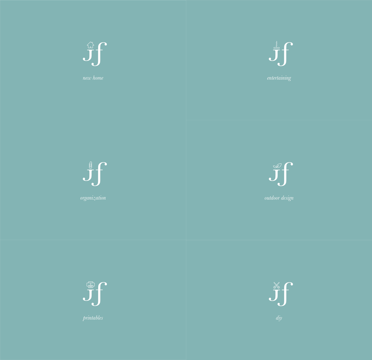
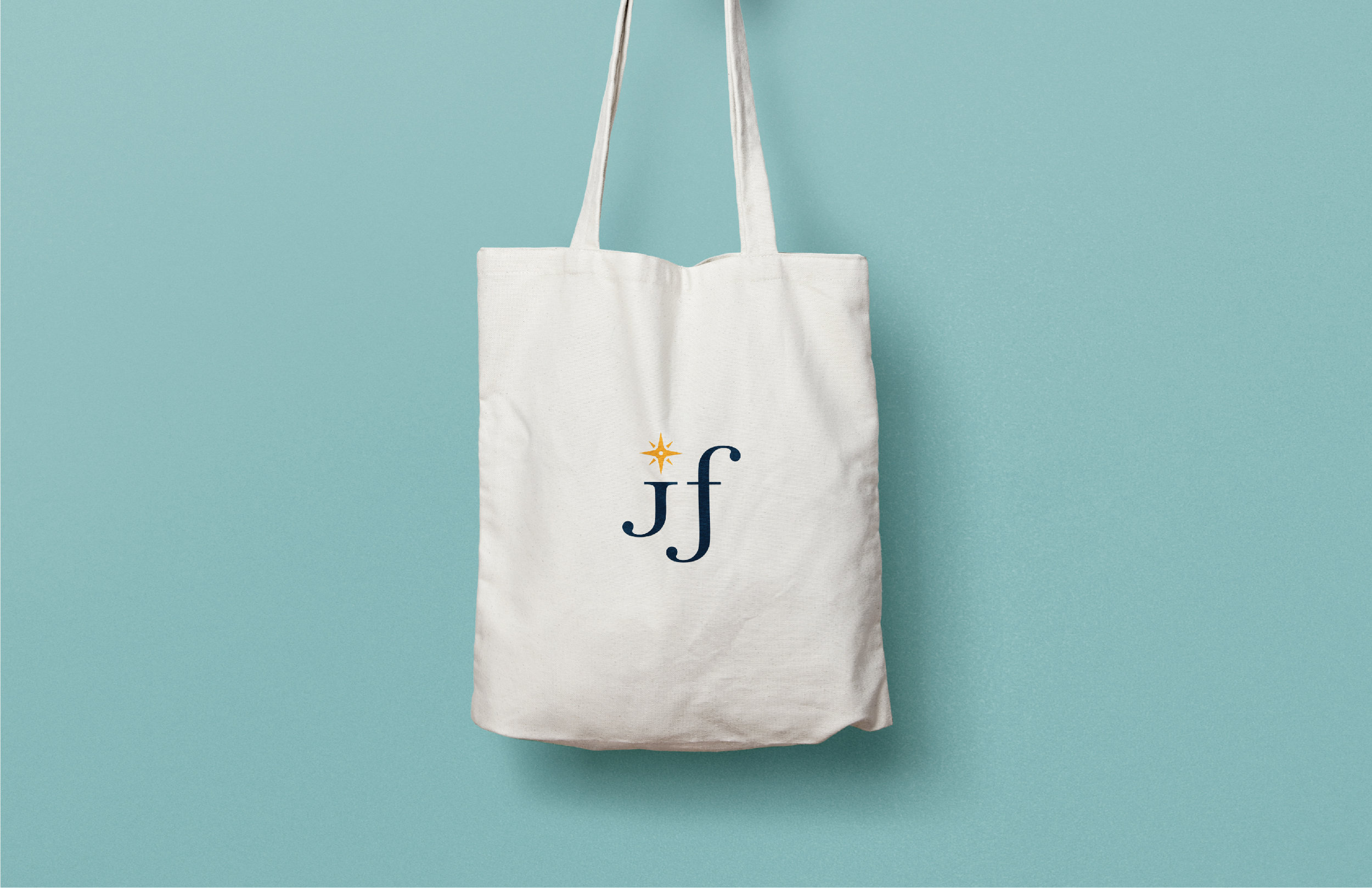
Jfaye Home is a blog based on all things home. The concept of the logo design is minimal and joyful. The dot of the “J” is replaced by a compass rose. The nautical influences and coastal location of the blogger drive this design. The compass also represents direction, which is fitting for a blog essentially about “directing” people in all things home decor. The icons were created to identify the different categories of the website.
